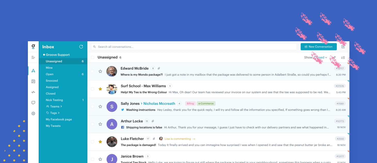
Choose between a classic three-pane layout or a modern four-pane layout.
Classic View is here! We know that a lot of our customers were missing the classic three-pane layout from legacy Groove and today we’re excited to announce that this view is now available again in Groove 2.0.

Users can easily toggle between Classic and Modern view using the button in the bottom left corner of the page, just above the user avatar. Or there is also a checkbox for this option in the user’s preferences under My Settings.

Classic View will look and feel very familiar to anyone who used legacy Groove. The center preview pane is gone and users can work through their list of conversations without distraction.

Additionally, we’ve made a few tweaks to the UI — larger and darker font, more visible collision detection, and increased sizing on certain elements — to help improve readability in the Inbox.
Two things that didn’t quite make this first iteration of Classic View are the hover to preview feature and the recent activity feed. Not to worry though, both of these are in the works and coming in future releases!
To take Classic View for a spin, log in to your Groove account and toggle that new button in the bottom left corner of your screen. We’d love to hear what you think!


