The classics are classics for a reason, right?
Due to the overwhelming feedback from our customers, it’s become clear that a large number of our users were missing the layout from legacy Groove.
The fact is that many of our customers really like the new four-pane view but some still prefer the classic three-pane view. We can’t change the way people want to work, so why force just a single option when we can give users the ability to customize their experience based on what works best for them?
Thus, the idea for a Classic View option was born and we’re very excited to roll it out to users over the coming weeks.
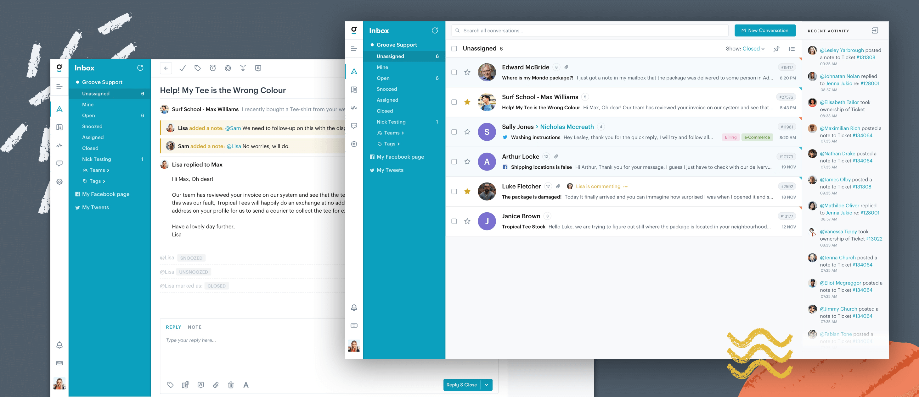
Until then, we’ve got a sneak peek of the familiar layout from legacy Groove that’s been updated to fit the new design of Groove 2.0, coming soon to a screen near you.

You’ll notice that the center conversation pane is gone and the activity feed is back in the right sidebar.
That activity feed will also be making an appearance in the Modern View as well sometime in the next few weeks (another popular request).
Additionally, we’ve been listening closely to all feedback involving the readability of Groove 2.0, and we have the following updates coming to both Modern and Classic views:
- Darker font to make it more legible
- Increasing the font size
- Improved layout so you can quickly see assignee and collision detection
- Increased sizing on common elements to make it easier to find information in conversations
It’s going to be a big update and a big step forward in addressing the majority of the concerns we’ve been hearing from customers since the introduction of Groove 2.0. We always listening and we’re trying to turn that feedback around as quick as we can. 🙂
If you have thoughts you’d like to share on the new Classic View or anything else regarding Groove 2.0, we’d love to hear from you!


