I know, I know… It’s been a while since you’ve heard from the Groove Engineering & Product team. That’s not because we’ve been taking it easy over here at Groove headquarters—quite the opposite, actually!
The Groove team has been building some large core components for the next phase of our products, along with a huge focus on the reliability and performance of the existing Inbox.
During September, we completed several of the larger items on our project list!! This means you will start seeing more and more of the products coming to life in the upcoming weeks. 🤘
Here’s what we’ve completed during September—and what you can expect in the upcoming months.
What’s new
The new Groove WidgetLive
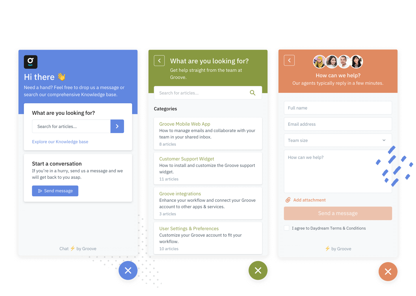
As you may have seen, we’ve launched a brand new Groove Widget!

We built the new Groove Widget from the ground up, taking in all the great feedback from our customers (thank you!) over the last few years. The new widget has a clean modern look with fully customizable branding features (select your own colors and logo).
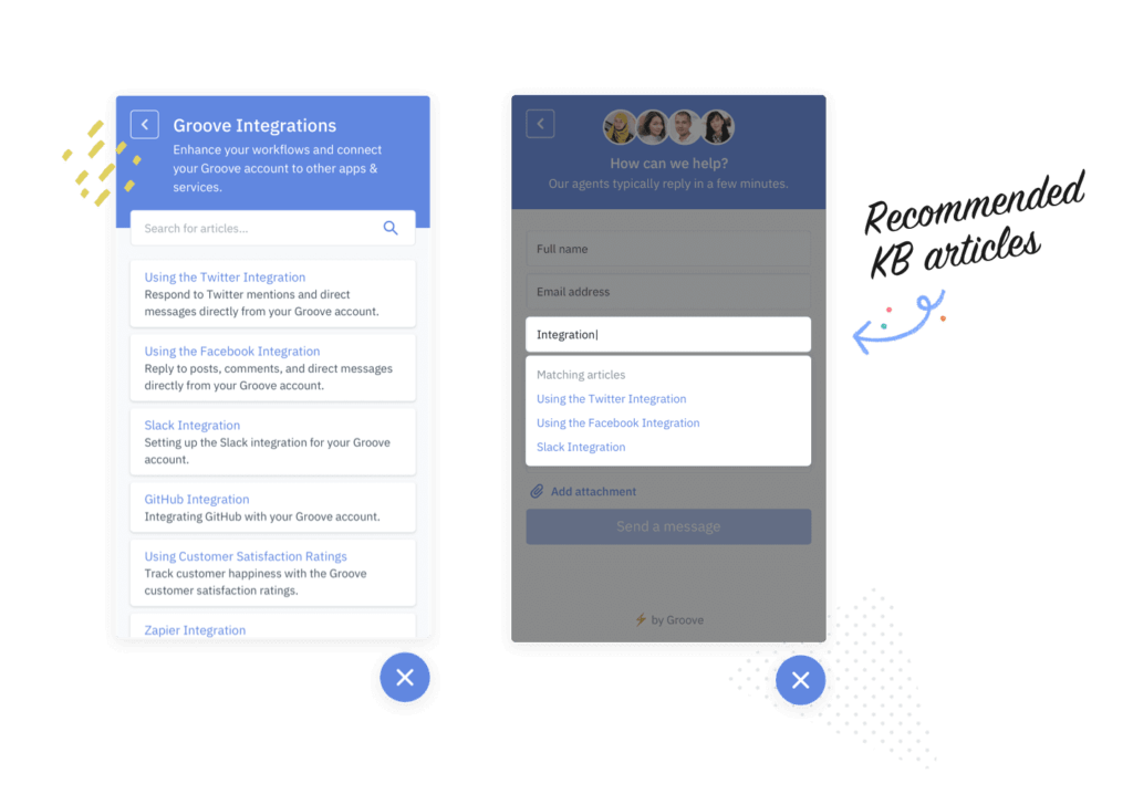
You can also include your Knowledge Base directly in the widget, giving users the ability to search for answers before reaching out to you. When a visitor starts typing a question, the widget can automatically recommend Knowledge Base articles from the widget.

Finally, the contact form includes a variety of default fields you can configure for new contact requests (such as name, subject, etc.) and a custom question feature, which has been one of our customers’ biggest requests for the Widget. This lets you create a custom question field, which is shown on your contact form for visitors to answer.
In early testing, we’ve seen a 33% reduction in support requests when customers make use of the Groove Widget with the Knowledge Base enabled. Getting started with the new widget only takes a few minutes. A full walkthrough is available for you here.
Most importantly, the new widget will be a prerequisite for the new Groove Live Chat product, which is currently in development. We highly recommend installing the new widget if you are planning to use Live Chat in the future!
Custom snoozeLive
We’re very excited to announce that custom snooze is now live!
You can now choose any date and time when you snooze a conversation. We’ve also included a handy “Last used” option. If you want to snooze several conversations for the same time, you won’t have to pick the date and time over and over.
We’ve also removed a bunch of the old snooze default options and replaced them with more logical options for your convenience.
Performance and reliability improvementsLive
Our team has had a huge focus on the performance and reliability of the Inbox over the last few months, and we’ve made a wide range of improvements.
Speed improvements for all accounts
When navigating between conversations and folders, you should feel things are a bit faster. Well, if we are honest with you, it’s 300–400% faster! Our average loading time on conversations has dropped from around 250ms to around 85ms*. We also introduced a host of optimizations for larger accounts and older machines.
*This applies to nearly all emails, but conversations with extremely long threads or ones containing lots of attachments may take a little longer to load. We’re no wizards, after all.
Lazy loading
To get your Inbox to respond even faster, we introduced lazy loading to Inbox conversations.
What’s lazy loading? Basically, when navigating between conversations and folders, we automatically load the content of the next few emails in the list. This way, when you click on them, they open pretty much immediately.
Reliability
Our team introduced a host of reliability improvements for the Groove Inbox, including:
- No more incorrect or out-of-sync folder counts.
- Collision detection is now far more accurate.
- No more dropped or lost drafts and notes.
Some polishLive
While the majority of the team has been working on larger items, we have carved out a bit of time to work on polishing the Groove interface.
Here are a few highlights:
- A new snooze indicator showing you when a conversation is snoozed for in the email list.
- A snooze option to snooze until Monday.
- Cleaner names and events in your conversation actions.
- New conversation headers for conversations that have been marked as spam or moved to trash.
- New trash folder displayed on all accounts.
- Design improvement to the conversation header action buttons.
- A new indicator of the last message seen and correct anchoring when moving between the conversation and folder list in the classic view.
- New navigation buttons to easily move between conversations in classic view.
- Prettier code highlighting on Knowledge Base articles, and now consistent with what you see in the editor, too.
What’s next
Live ChatIn progress
With the Widget (mentioned above) completed and launched, it clears the way for our Live Chat beta, which will kick off in early Q4. We have a working version internally here at Groove. We’re currently adding the last few features before the open beta. Keep an eye on your inbox for the announcement around this soon!

iOS and Android appsIn progress
We delayed the launch of our native iOS and Android apps due to a shuffle of priorities, but we now have a team dedicated to working on this. We’re making good progress, and we expect to release the iOS version around the end of the year with Android to follow soon after.

CRMIn progress
We’ve made a lot of progress on Groove’s new and more powerful CRM features. All the underlying work for it has been completed, and we’re now fully focused on bringing it to the Groove website.
One of the key features of CRM is a new sidebar that will show in your Inbox and alongside Live Chat conversations. It’s highly customizable—from adding custom contact or company fields to setting field order and visibility, it’s all about enabling you.
We’re currently using the CRM internally, and we’re aiming to bring it to all accounts within the next few months.
Other itemsIn progress
In addition to the bigger projects, we’re working on several smaller initiatives, including:
- Draft improvements, ensuring drafts are available on any platform you’re logged in on.
- Additional polish and cleanup, improving many of the visual elements of the application (kinda like a fresh coat of paint)!


