This guide covers the ten most valuable customer experience metrics for small to medium businesses broken down in practical terms.
It’s primarily meant for those of us:
- Averse to analytics (english and communications majors, rejoice!)
- With little or no time to spare (this should be all of us, right?)
- Who care about customer experience but struggle to be heard
But, before we get into how to measure…
What are customer experience analytics?
A simple customer experience analytics definition is collecting data on engagement metrics and assigning those numbers monetary value in order to set concrete goals and improve customer experience.
Conceptually, customer experience analytics prove the worth of customer experiences (CX) in the business world.
As a numbers-averse customer experience manager, I struggled with understanding analytics and setting KPIs for years. In hindsight, it was the only reason anyone took my team and I seriously.
Table of Contents

Customer experience metrics for small to medium businesses
To keep this actionable and straightforward, I’ll use two example companies to show you exactly how to put these metrics to work in the real world.
Example one: a project management software SaaS company called Proma.


- Proma serves other small businesses and startups looking to optimize their workflow.
- With about 50 team members total, the four-person customer experience team packs a punch
- Melissa (coincidence very much intended) just got promoted from CX specialist to manager; eager to show the team’s success under her leadership, she’s looking to establish baselines for CX metrics and set goals for the future
Example two: an e-commerce art store, aptly named ArtStore.


- ArtStore serves as a middle-man between artists and consumers, so customers include both sellers and buyers
- With 15 team members, their Head of Customer Experience, Kenzy, is the sole person responsible for all customer engagement
- ArtStore’s founder asks to see some customer experience metrics so they can correlate it with revenue and growth; in addition to doing literally everything else associated with customers, now Kenzy needs to quickly put together numbers to accurately measure her efforts
Shall we begin?
1. NPS (Net Promoter Score)
NPS (Net Promoter Score) measures a customer’s desire to recommend a product or service. An NPS Survey generates the numerical value associated with this score by subtracting the percent of detractors from the percent of promoters for a given time period.


Here’s some more jargon you’ll need to know:
- Promoters: Customers who selected 9 or 10 on their NPS survey.
- Passives: Customers who selected 7 or 8 on their NPS survey.
- Detractors: Customers who selected 0-6 on their NPS survey.
Proma’s CX manager, Melissa, quickly puts together an email to gather NPS. The email links to a survey she built using Typeform. The survey only asks one question:
- On a scale of 0-10 how likely are you to recommend Proma?

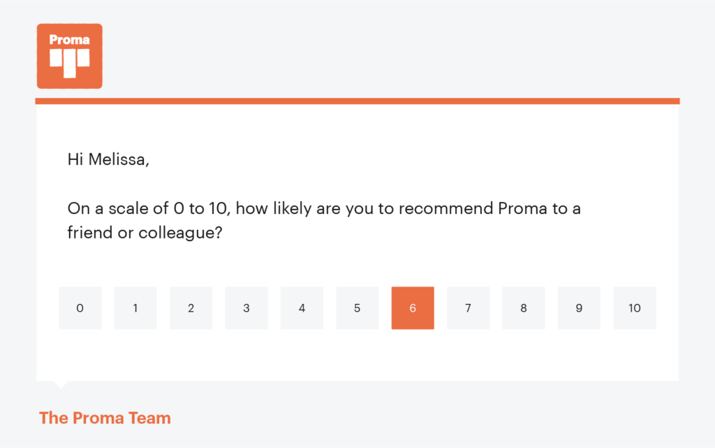
The customers’ responses gather in Typeform. Melissa waits a week to pull all the results. Then, she exports them into a spreadsheet.
Of the 30,000 emails sent, 3000 customers responded. Since this is the first time an NPS survey has been sent, Melissa doesn’t know the “normal” amount of responses, but 10% seems workable. And now it’s in the books as a baseline. She’ll try to get over a 10% response rate next time around.
Her exported spreadsheet is literally just a list of numbers. To see promoters, she creates a filter to only view 9s and 10s. To see passives, she makes a filter for 7s and 8s. And to see detractors, she makes a filter for 0s-6s.
There are one thousand 9s and 10s. Fifteen hundred 7s and 8s. And five hundred 0s-6s.
She takes each of these and divides it by the total number of responses, three thousand.
- 1000 9s and 10s / 3000 = 33%
- 1500 7s and 8s / 3000 = 50%
- 500 0s-6s / 3000 = 16%
To get the final NPS result, she subtracts the percent of detractors from promoters.
- 33 – 16 = 17
Jargon alert: When calculating final NPS, drop the word “percent.”
Proma’s NPS is 17. Now what?
You measure NPS on a -100 to +100 scale:
- -100-0 = Bad (This means most people selected lower scores and wouldn’t recommend your company)
- 0-50 = Good
- 50-70 = Excellent
- 70-100 = World-class

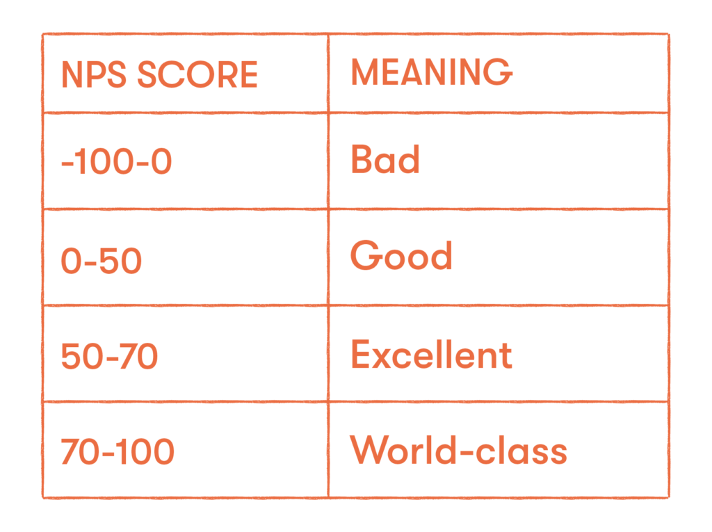
Real talk, though, these numbers don’t take any specifics into consideration. The best way to track your progress is to simply compare it to yourself.
Use the standard NPS scores above as a frame of reference. But don’t get too attached to these baselines if they simply don’t make sense for your company.
Back to Melissa. Now she knows that +17 NPS equates to a pretty good score. She’s happy to report that NPS looks pretty good without even having measured it before. She sets this as a baseline, and targets an even +20 NPS for next quarter. Hooray for concrete goals!
Don’t worry, e-commerce friends, I didn’t forget about Kenzy.
Kenzy uses Google Forms to create two separate NPS surveys for ArtStore. She wants to differentiate between the artists’ NPS and the consumers’ NPS. Different customers with different needs get different NPS surveys.
Her surveys consist of two questions:
- On a scale of 0 to 10, how likely are you to recommend ArtStore to a friend or colleague?
- What is the primary reason for your score?

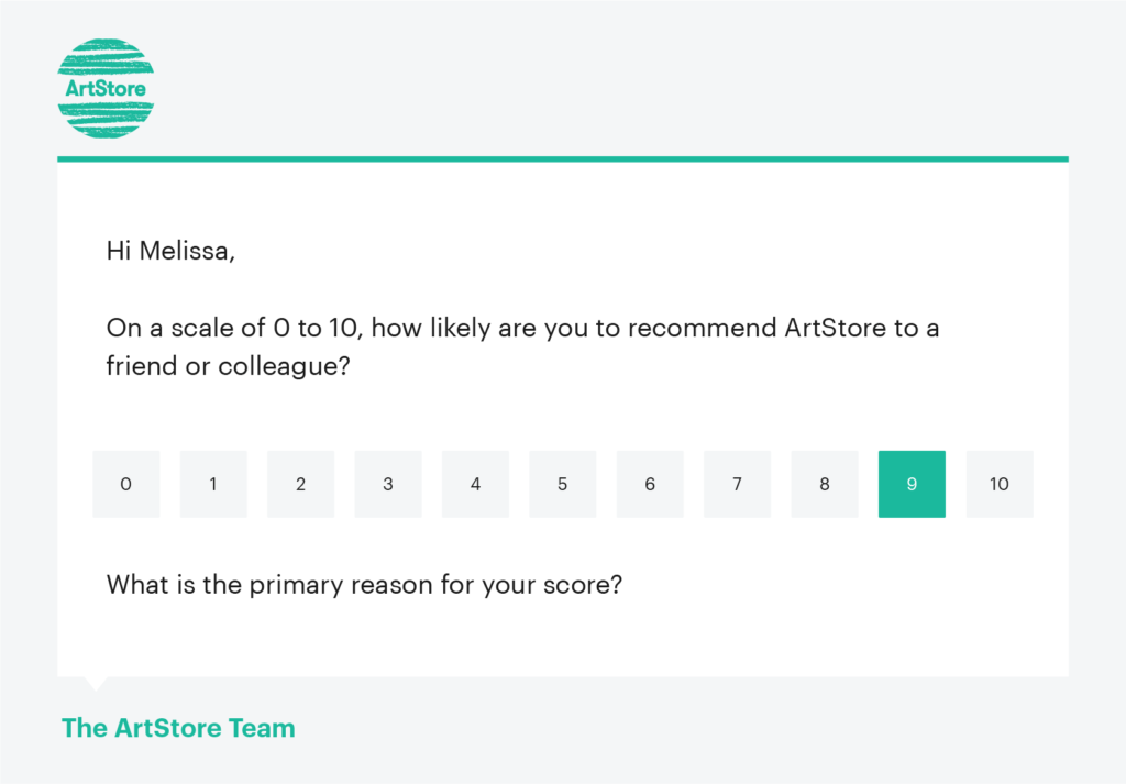
Kenzy includes an optional, open-ended second question to add some color to the numerical responses. She plans to find trends in these responses and turn them into product requests.
She creates two separate emails in Klaviyo using the different audience segments. Artists will get one survey. Buyers will get the other.
After a week, she sends a reminder to those who haven’t completed the survey yet. By week two, she schedules time into her day to analyze results.
Of the 1500 artists who received the survey, 1000 responded. And out of 5000 buyers, 700 responded. Kenzy pulls up the calculator app on her phone and divides responses by total emails sent to see how engagement looks.
Artists seem pretty engaged, with a 66% response rate. Whereas buyers have a lower response rate at 14%. Already, she’s seeing the value in this survey. Maybe she could do more to engage buyers…
Now, she exports the responses into two Google spreadsheets. She filters for promoters (9s and 10s), passives (7s and 8s), and detractors (0s-6s).
For artists, the breakdown is as follows:
- 700 9s and 10s
- 200 7s and 8s
- 100 0s-6s
She divides each by the total number of artist responses to get percents:
- 700 promoters / 1000 = 70%
- 200 passives / 1000 = 20%
- 100 detractors / 1000 = 10%
Then, she subtracts detractors from promoters to get NPS.
- 70 – 10 = 60 = NPS
Kenzy doesn’t have time to celebrate, and frankly she’s not even sure if that’s a good score (it is!). She puts “+60” in big bold letters at the top of her spreadsheet with the date. She’ll send this survey out again in a few months to see if it goes up.
On to the next segment for ArtStore: the buyers.
Of the 700 responses, here’s where they fell:
- 100 9s and 10s / 700 = 14% promoters
- 200 7s and 8s / 700 = 28% passives
- 400 0s-6s / 700 = 57% detractors
- 14 – 57 = -43 NPS
Kenzy starts to panic. She barely acknowledges the incredible NPS for artists, and instead focuses on this somehow negative score for buyers. This can’t be good.
Kenzy, stop, breathe, and focus on the 99 things you did right today, okay? Then, dive into that second question you smartly asked to figure out why this number is so low and exactly what you need to do to fix it.
She scrolls through the responses in the Google spreadsheet and it becomes glaringly obvious. Buyers want two things: more payment options and more tracking details.
Kenzy adds these requests to the Product team’s board, and backs up her reasoning with the survey stats. When ArtStore’s product manager sees the survey results attached to the feature requests, he immediately bumps up the priority. He comments that new payment and tracking options will be available by the end of the month.
Pretty cool. The power of data.
2. CSAT (Customer Satisfaction Score)
CSAT (Customer Satisfaction Score) uses a numerical value to describe how happy customers are with a particular interaction.
Customer support teams typically measure the success of their interactions with this score. It is also commonly used to determine satisfaction with a specific product or service.


Proma wants to look solely at how CSAT tracks with regards to support inquiries. Melissa worked extensively with the team’s helpdesk, Groove, so she knows exactly where to look.
Each email includes a CSAT survey. The results live in the Groove dashboard.

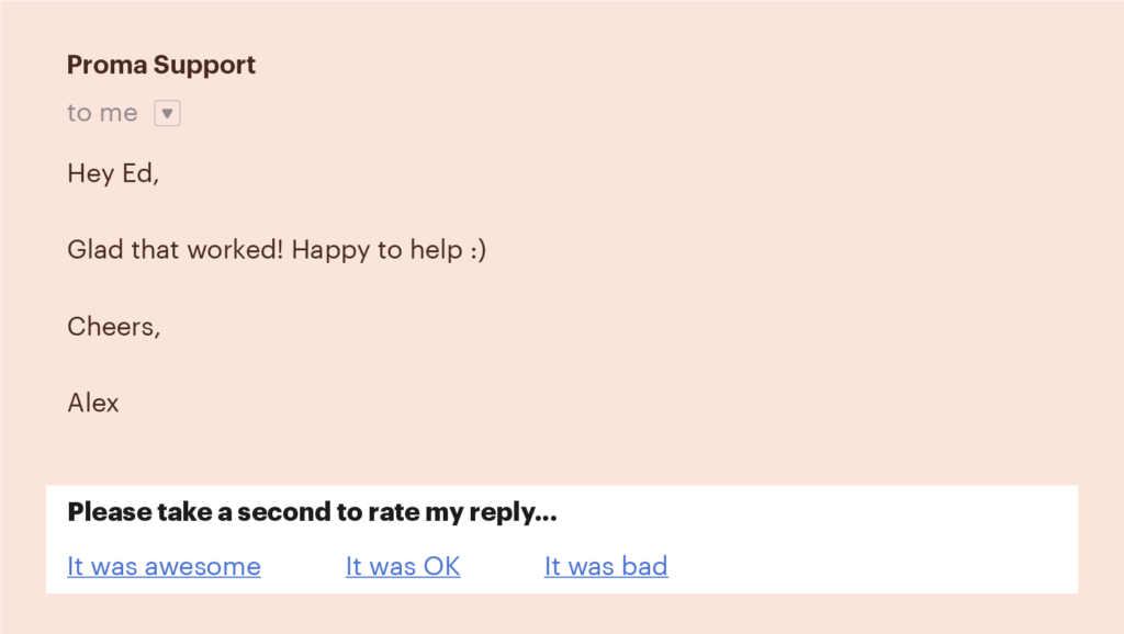
She opens up the Reporting view and clicks on Happiness to see the results.

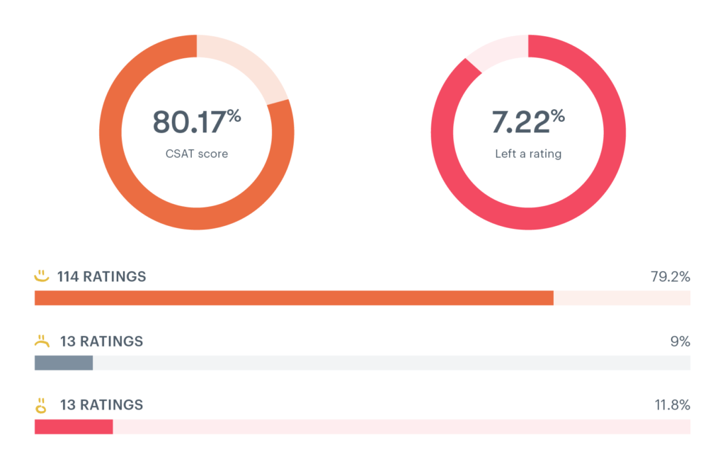
With the term “CSAT” staring her right in the face, she relishes in the fact that she doesn’t need to do anything more for this one. She’ll just filter dates to track CSAT over various time periods.
Since the inbox automatically tracks CSAT, Melissa can even pull from historical data. She notices CSAT was around 70 for most of last year, but has been at 80 for the past few months. This metric is already trending upwards. She’ll set a calendar reminder to track this score every quarter to make sure it remains steady.
Kenzy at ArtStore once again decides to make her life more difficult. She wants to find out how satisfied buyers are with the actual piece of art, rather than with the support team. The automatically tracked CSAT score from the inbox won’t cut it.
She goes back to Google Forms and creates a simple two question survey:
- On a scale of 1-5 how satisfied were you with picture you ordered?
- Tell us more about why you chose this score. (optional)
She creates a segment in Klaviyo to only send this survey to people who purchased within the past week so it’s relevant. The email goes out with the survey link and responses begin to pour in.
After 100 responses, Kenzy analyzes the results. She filters for those who scored satisfaction a 4 or 5. These are considered satisfied customers.
The total number of satisfied customers is 45. To get CSAT, Kenzy will divide this by the total number of responses and multiply by 100.
- 45 / 100 x 100 = 45%
Those optional comments are definitely going to prove their worth. Customer feedback points to shipping and tracking confusion again. Kenzy sets a goal to hit 50 CSAT once those product changes go live.
3. Retention or repeat customers
Customer retention describes the ability of a company to maintain its current customer base after their initial acquisition.
High retention rates indicate customer desire to continue using a product or service, which leads to repeat purchases, increased revenue, and steady business growth.


Proma’s founder asks Melissa to find out retention rate for the past three months so she can update an investor. Yikes, okay Melissa stops what she’s doing and gets to work.
She pulls up the company’s spreadsheet for high-level analytics and opens the tab for Revenue. There’s a section tracking the number of “active accounts” week to week. Bingo.
Today is August 2, so three months covers the period from May through July. She grabs the number of customers from the end of the period, July 31 (3000 active accounts), and the number of customers from the start, May 1 (2850 active accounts).
Then, she screws up. (I’m going to walk you through her flub so you don’t make it too.)
She subtracts the amount of customers at the start from those at the end to get the number acquired (150 new accounts). Seems right, doesn’t it? But it’s wrong.
This becomes apparent when she plugs it into the retention formula:
- 3000 – 150 / 2850 x 100 = 100%???
Melissa realizes “customers added” is it’s own data point, not something you can find from a formula. The lesson dawns on her that the way she calculated retention above did not account for lost customers.
She spends way too much time trying to figure out “added customers” from that revenue tab before finally just asking the product manager. The PM tells her it’s tracked separately and Slacks her the number.
Turns out, there were 500 new accounts added.
Now, she plugs in the right numbers to the retention formula:
- 3000 – 500 / 2850 x 100 = 87%
Melissa sends the number to her founder and goes on with her life.
Kenzy at ArtStore wants to look at retention to add even more fire behind improving the buyers experience. After looking at NPS and CSAT, she assumes low retention for art buyers. She needs a number to give her assumption real weight, though.
She opens up her Shopify dashboard to view customer reports. She’s going to use six months as a time period to make sure there’s enough data, and since customers don’t necessarily purchase on a consistent basis (i.e. recurring month-to-month plans).
Today is August 2 in Kenzy’s world, so she sets her date range from February 1- July 31. She pulls both the number of customers from the beginning (1800) and end of the period (1200) using the “Customers over time” report.
Then, she filters out returning customers to see how many first-time customers were added during these months (900).
She plugs it into the retention formula:
- 1200 – 900 / 1800 x 100 = 16%
Just as Kenzy thought. She adds this number to the product request ticket to emphasis it’s importance. She can’t wait to check this number again after they implement improvements.
4. Churn
Customer churn rate describes the drop off in engagement with a customer, whether they no longer actively use a product or formally end a service agreement.
High churn rates signify low levels of customer satisfaction and decreased business growth.


After Melissa realized her mistake in calculating retention, she’s been eager to look at churn to actually identify the number of customers lost. She’s a glass half empty kind of gal.
Thankfully, she already pulled the numbers she needs to calculate churn when she pulled numbers for retention.
Looking at the same three month time period, she grabs the number of customers from the start (2850 on May 1) and the number of customers at the end (3000 on July 31).
Simply plug it into the churn formula and …
- Churn = 2850 – 3000 / 2850 x 100 = -5.2
Um … what? How can you have a negative churn rate?
If you’re really ridiculously good. Proma killed it this last quarter and added more customers than they lost. This equates to negative churn. It’s a good thing.
Kenzy wants to check out churn rate for artists now, since she thinks it might actually be pretty good. And she needs a pick me up.
Looking at the past six months, she grabs the number of artists at the start and end of the period. ArtStore doesn’t use Shopify to track the artist side of things, so Kenzy reaches out to her founder to get the number of artists on February 1, and the number on July 31. Then she plugs it in …
- Churn = 2000 – 1800 / 2000 x 100 = 10%
Nice! This churn rate makes Kenzy super happy. She sets it as a baseline, and creates a goal to keep it at 10% even as the total customer base grows.
(Good thing Kenzy remembered not to compare her metrics to other businesses in different verticals. Otherwise, she’d be dwelling on why her churn rate wasn’t negative. Instead, she’s playing against herself, so she’s bound to win.)
5. Customer Effort Score
CES (Customer Effort Score) defines the amount of effort a customer needs to put in to resolve an issue with a product or service.
This score creates a numerical measurement to pinpoint and track specific areas for improvement within a business.


Proma decides to focus on CES specifically for their demo experience. After a potential customer signs up for a demo, they automatically receive a follow up email with a link to a Typeform survey.
The survey asks one question:
1. To what extent do you agree or disagree with this statement:
Proma made it easy to schedule a demo.
1 (strongly disagree) → 7 (strongly agree)

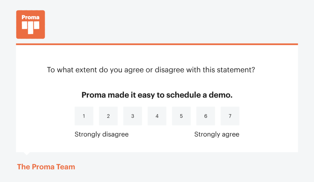
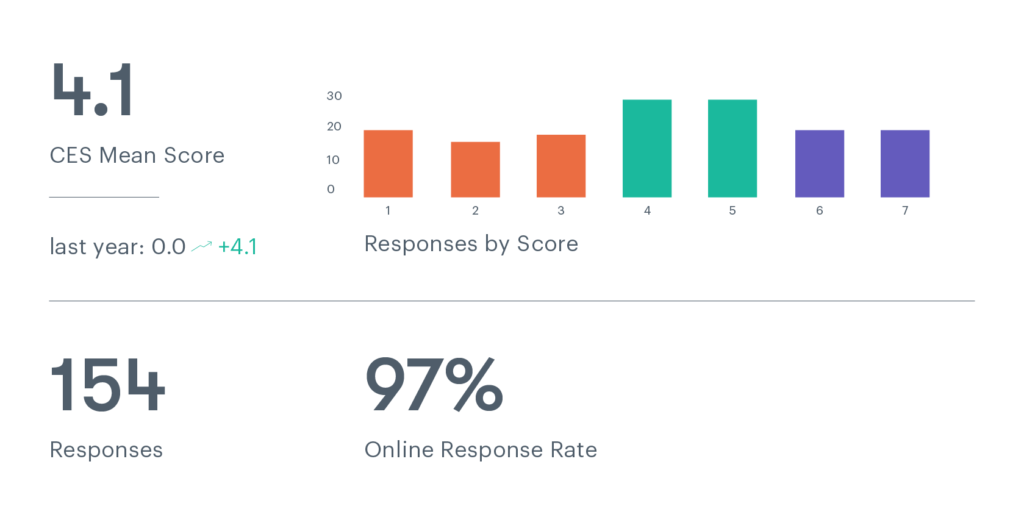
Melissa gathers all the responses from the past month into a spreadsheet and does something she hasn’t done since middle school. She calculates the mean.
With only 25 demos this month, it’s not as scary as it seems.
- 19 people chose 7
- 2 people chose 6
- 0 chose 5
- 0 chose 4
- 3 chose 3
- 0 chose 2
- 1 chose 1
So …
- 19×7 + 2×6 + 3×3 + 1×1 = 133 + 12 + 9 + 1 = 155 / 25 = 6.2 = CES
Phew. The math checks out. The average Proma customer agrees with the statement. The demo trial process requires fairly low effort.
Kenzy finally decides to make her life easier with customer experience analytics tools. She integrates an app with Shopify to automatically ask and track CES. She enables a pop up after purchase with the following question:
- How easy was it to purchase from ArtStore?
(1) Very difficult → (7) Very easy
The app tracks responses over time without Kenzy doing any math on her end. She’ll be looking at this weekly, and especially keeping an eye on it after product changes go live.

6. Average Resolution Time
Average Resolution Time measures the amount of time lapsed from when a customer support agent first opens a customer’s email to when they send out a final reply signifying resolution of the query.
Help desk platforms track the exact time spent on each ticket then aggregate to provide an average resolution time.
What a coincidence … both Proma and ArtStore use Groove for a helpdesk. They’re going to pull different insights from it, but inbox software makes the process relatively painless.
Frankly, if you don’t use a helpdesk that calculates average resolution time for you, then you shouldn’t try to calculate it yourself.
Calculating average resolution time requires you to look at timestamps of each email, figure out the time spent resolving inquires, then find an average across all your emails. But what happens when a customer re-opens an issue? Yeah … don’t worry about it.
In the amount of time you spend manually calculating average resolution time, you could’ve responded to a bunch more emails. Just pull this from your helpdesk.
Melissa at Proma wants to look at the average resolution time from the past month to see if she needs to hire a new support agent. The team plans to add a guaranteed 12 hour response time to their SLA. If the current average resolution time surpasses 12 hours, Melissa will need to hire another agent.
She sets the desired time period within Groove’s Reporting dashboard and views Productivity.

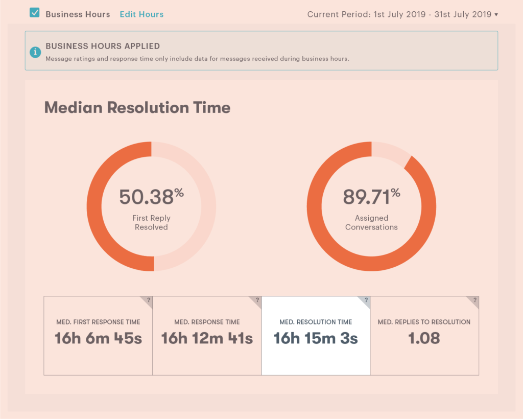
With a median resolution time of 16 hours, Melissa decides to hire a new team member.
At ArtStore, Kenzy cut herself some slack and hired a part-time support agent, Brittany, to respond to general inquiries. Kenzy wants to track Brittany’s progress as she gets ramped up. She filters the Reporting dashboard to view “Agents” and clicks into Brittany’s individual report.

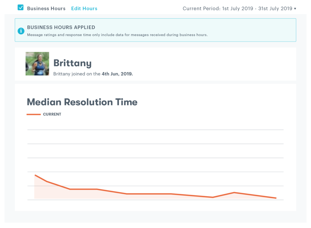
Using a graph view, Kenzy clearly sees that Brittany’s resolution time is going down overtime. Nice! This means she’s getting quicker at resolving customer issues.
7. CLTV (Customer lifetime value)
CLTV or CLV (Customer lifetime value) is a metric used in marketing and customer experience that measures the amount of money a customer brings to your business over the entirety of their relationship.


As a subscription-based SaaS company, Proma weighs CLTV heavily. Melissa has heard the team’s PM throw this term around, but she has no clue how to calculate it. Now that she’s got “manager” in her title, it’s time to find out.
She goes back to that high-level revenue spreadsheet and finds the numbers she needs:
- Customers typically pay $125/month for Proma’s software
- Average number of repeat purchases is 6 (this includes all their various payment plans: 1-month, 3-month, or annual renewal)
- Average time customers use Proma is 1.3 years
She plugs it in:
- $125 x 6 x 1.3 = $975 = CLTV
Each potential new customer represents $975 in revenue. Which means, each lost customer equals -$975. That can add up.
Melissa will keep this number in mind as she works on improving retention. Maybe she can even use it to show how much revenue she’s helped Proma gain or keep, and ask for a raise!
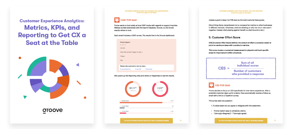
Eager to prove the value of your own hard work? Download Customer Experience Analytics: Metrics, KPIs, and Reporting to guide you through the process.
As an e-commerce store, ArtStore uses an integration to make sense of the data in their Shopify dashboard. To find CLTV for art buyers, Kenzy looks at the past three months, then pulls the Average Order Value ($60) and average purchase frequency (2.7).

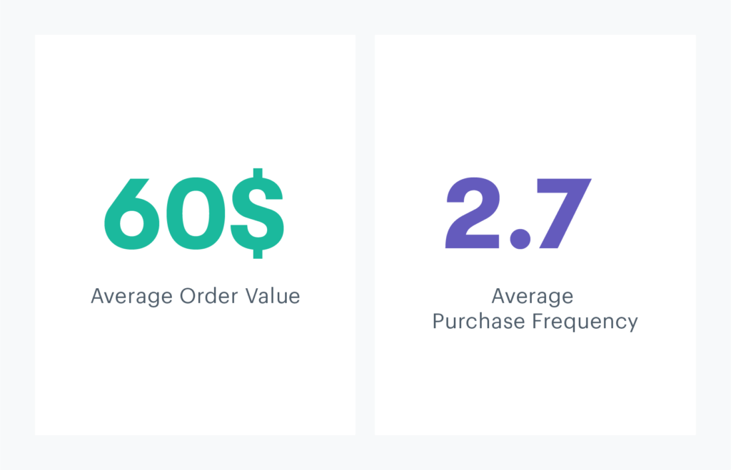
ArtStore does not offer subscriptions or contracts to its customers, so Kenzy gets a little stuck on the final data point. Effectively, once someone buys a piece of art, the transaction ends. They may or may not buy again.
She’s going to use what she’s got and multiply the two numbers she does have to solve for customer value. It’s just missing the lifetime part.
- $60 x 2.7 = $162 = customer value
That gives some weight to each customer. She wants to get this number up to $180 by the end of the year. She’ll work on either increasing average order value or repeat purchases.
Since she already plans to improve customer happiness and retention, it makes sense to work on increasing repeat purchases. She sets a goal to move average repeat purchases up to three.
Now, just for kicks, Kenzy uses an arbitrary number to figure out that “lifetime” part. She assumes customers will continue buying from ArtStore for about three years. So she plugs that into the equation:
- $60 x 2.7 x 3 = $486 = CLTV
Wow, that’s a pretty hefty increase in revenue potential. Retention is definitely where it’s at. Kenzy locks in her game plan.
8. Social sentiment
Social sentiment tracks the overarching emotional response from the public to a business or individual on social media platforms.
Social media sentiment goes beyond tracking numerical levels of engagement and instead attempts to reveal brand perception by analyzing tone and context of followers’ posts.
Proma recently started using Hootsuite to track social sentiment for them. Previously, Melissa just glanced at the company’s social accounts whenever she remembered to. She would simply “get a sense” of how people felt toward the brand.
No one seemed overly angry, or super happy. She didn’t think to measure it.
Now that they’ve put a number to it, she can effectively track and improve sentiment.

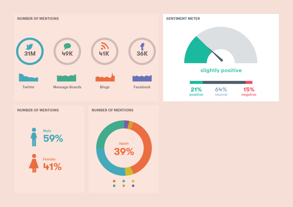
ArtStore doesn’t currently use any social analytics software, and Kenzy doesn’t have time to research platforms. She is curious about social sentiment, though.
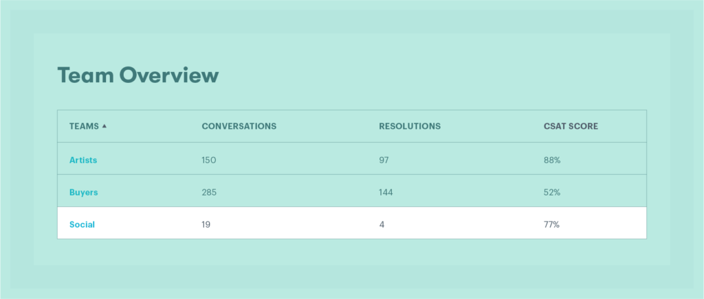
Since ArtStore responds to most of their social media inquires through their helpdesk, Kenzy devised a workaround to track sentiment using Inbox Reporting.
She created a Team called Social, specifically to deal with (you guessed it …) social media. ArtStore’s social platforms automatically integrate with Groove, so any mentions get turned into emails. She tracks the Social team’s CSAT score to get a sense of customer sentiment.

9. Reviews and ratings
Reviews and ratings provide an aggregate of customer opinions for a product or service.
Reviews ask for written comments to provide customer sentiment. Ratings offer a numerical collection of scores for quick and easy comparability.
Melissa singles out third-party site Capterra as the go-to for reviews and ratings. Proma’s website has reviews from customers, but those were solicited and curated from the marketing team. Melissa wants to track offsite customer reviews on Capterra only.
Melissa creates a Capterra vendor account. She assigns a customer experience team member to check in and respond to reviews every Friday. The site automatically tracks number of reviews and average ratings for you, so Melissa doesn’t need to create her own formula for this.
She looks up Proma’s competitors though, and realizes they all have about twice the number of ratings. Proma’s score isn’t bad, but the more people that review it, the more trusted the score.
Melissa creates an email campaign to send to active users from the past three months. She includes a link to Capterra and asks users to leave a review if they’d like.
Nothing too pushy. No real incentive. No request for a “good” rating. Just a heads up that customers can add their two cents to Capterra to help fellow project management software seekers.
Within a week, reviews double. And the score holds steady!
ArtStore is much more concerned with the onsite reviews left on their store. Customers comment on everything from delivery time to image quality.
To track these scores overtime, she researched customer experience analytics solutions to find some of the bigger names in the e-commerce review & rating game, including: Stamped.io, Yotpo, and TrustPilot.
After giving each one a try, she went with TrustPilot.

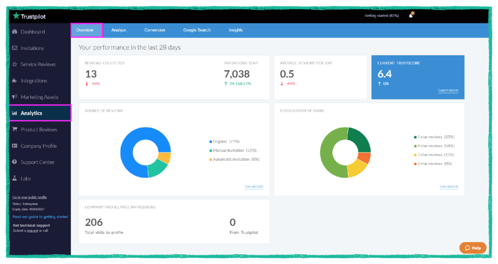
Now, Kenzy can clearly see when reviews & ratings need more attention and take steps to improve them.
10. Referral rates
Referral rate measures the amount of customers coming into a business from a specified referral program.
It’s measured as a percent of the total number of purchases. Standard referral rates differ across industries, but are often associated with rates for customer satisfaction, retention, and growth.


Melissa spent a lot of time Googling how to manually create and track a referral program, and came up empty handed.
Her idea was to just start telling customers that they will get 10% off their next renewal of Proma when their friends sign up and she’d manually deduct it from their next purchase.
But she had no idea how to track this. She contemplated making a spreadsheet for any referred customers.
She’d take the number of referred customer purchases from the spreadsheet and divide it by the total number of purchases to see the referral rate and improve it over time.
But, come on, you already see how unsustainable this process would be, right?
Computer beats human when it comes to referral programs. If you’re going to implement a referral program, you’ll want to use customer experience analytics software, which will calculate referral rate for you.
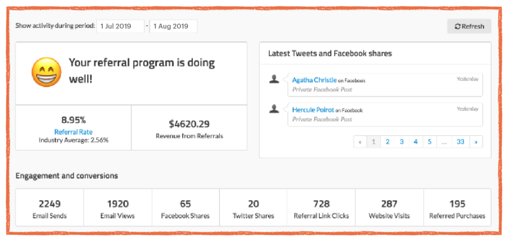
Melissa decides on ReferralCandy and begins her campaign. She’ll create a few different incentives to test which performs best. Ultimately, she wants a baseline for referral rate so they can set goals for the future.
ReferralCandy supplies her with all the metrics she needs in their dashboard.

Kenzy’s friend Natasha is an interior designer with over 5,000 followers on Instagram. They discuss a collaboration where Natasha would offer a discount code to her followers and promote ArtStore.
Kenzy creates a discount code NATASHAHOMES on Shopify. Natasha shares the code with her followers on July 15. Kenzy watches the “sales by discount” report for updates.

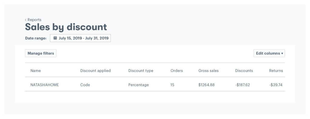
On July 31, she calculates referral rate. She grabs the number of orders using this code (15) and divides it by the total number of orders from July 15-31 (100).
- 15 NATASHAHOME orders / 100 total orders = 15% = Referral rate
Wowza, that worked. Kenzy uses this rate to convince her founder to put more money into influencer marketing. It’s clearly worth it!
Phew! That was a lot. Grab your PDF of this article to keep these 10 metrics on hand as your company (and career) grows.
Use metrics to set customer experience KPIs
What are customer experience KPIs?
Customer experience KPIs (key performance indicators) designate a specific numerical target to determine success or failure as it relates to customer sentiment and engagement. Customer experience metrics guide KPIs by tracking levels of satisfaction and growth overtime.
A CX Index reveals annual baselines for KPIs in the form of lengthy research culled from various industry leaders.
For small to medium businesses, baseline KPIs prove most realistic when based on their own historical metrics.
Using customer experience metrics to set KPIs
Melissa’s evaluation of average resolution time above provides a nice example of how to draw conclusions and use metrics to set KPIs.
She tracked this metric over the past year, watching average time move from 48 hours down to 16 hours. During the same time period, customer satisfaction increased 20%. On a higher level, Proma’s customer base doubled and revenue increased.
Melissa draws the conclusion that decreasing average resolution time leads to increased customer satisfaction, growth, and revenue.
Due to this finding, she wants to set a KPI to keep this number as low as possible. She thinks a reduction to 12 hours makes sense. Without getting swept up in industry standards, she simply looks at her own metrics to set realistic goals.
Proma’s KPI for average resolution time goes on the books at 12 hours.
So, essentially, a 12 hour average resolution time indicates optimal CX performance. If they hit this KPI, Melissa can claim it as a win, both for the CX team and the company at large.
Use KPIs to figure out customer experience ROI
Customer experience ROI (return on investment) reflects the value earned from customer experience efforts. Businesses use CX metrics and KPIs to evaluate ROI.
In marketing or sales, you can easily single out the cost and return for a specific campaign. However, CX ROI lies in a grayer area, making it harder to define. That said, a positive ROI may be the deciding factor in getting your boss or investors to take CX seriously.
When you put numbers to everything you do, CX ROI will be easier to show.
Take Kenzy’s work with NPS from above. She used those optional comments to create product requests. One month later, those features all go live. Another month after that, she sends out an NPS survey and notices the score improved from -43 to +15!
She pulls up revenue numbers from the past month and sees it increased by 5%. Not a coincidence. Kenzy concludes the CX team was crucial to this revenue bump.
Typically the formula for ROI is:
- ROI = Net Profit / Total Investment x 100
Kenzy tweaks the formula for CX:
- CX ROI = Net Profit / CX people, technology, processes x 100
Using ArtStore’s numbers:
- $12,000 net profit for July / 8900 CX spend for July x 100 = 134%
That’s one hell of a return. CX teams function with hardly any budget, so chances are, you can show positive CX ROI too.
Kenzy wakes up in the middle of the night thinking that number seems absurd. Did she do the math wrong?
Not exactly, but she can’t necessarily claim the entire profit all to herself. ArtStore has five teams, each of which contribute equally to the company’s success. So she tries a new formula:
- $12,000/5 = $2400 / $8900 x 100 = 26% CX ROI
That number sits better with Kenzy, and it’s still a really great return.


Wrap up: CX analytics
I know numbers are scary. But, the Carrie Bradshaw in me can’t help but wonder if CX analytics hold the key to gaining respect for customer experience in the business world.
By correlating CX metrics with business KPIs and showing ROI, we could let the entire world know how much customer service impacts the bottom line.
The example ROI numbers from above are probably not that far off from your own calculations. Especially with ridiculously low CX budgets, and resourceful leaders like Melissa and Kenzy at the helm.
Set up your metrics to show your worth. Define those KPIs to prove your value. And bring it all back to the bottom line to show how CX directly affects the success or failure of your business.
